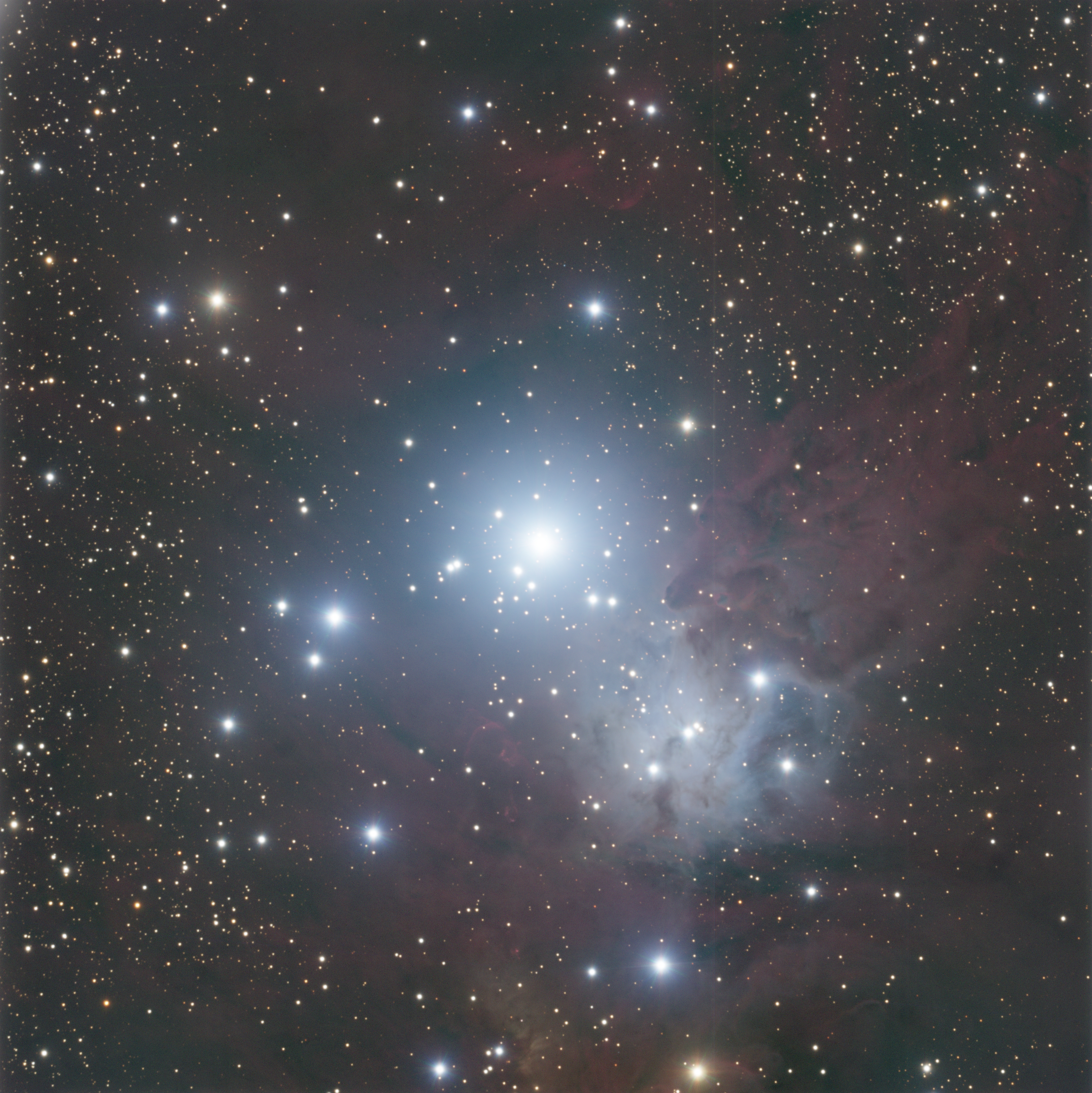
In this image acquired and processed by the author using PixInsight, is the young Galactic (Open) cluster NGC-2264. In terms of age, it is in its infancy at less than 5 million years, still shrouded in its star-forming gas and dust envelope. Image acquired with the 0.4 meter RCOS-RC telescope of Insight Observatory (see notes and description below under “Featured Image”.)
This is the first article in a multi-part series where we will use tools available in the image processing suite known as ‘PixInsight’ to visualize and learn Astronomy
Prolog
The series of articles that will be forthcoming was prompted by the introduction of a brand-new tool, released last year as a third-party add on to PixInsight, a post imaging processing suite used by many astronomers and astrophotographers to process and enhance raw image data obtained with their telescopes and cameras (see program notes and citations below). This tool ‘reads’ an image processed and produced by PixInsight and produces an HR (Hertzsprung–Russell) Diagram from the stars’ image data – this is the first of its kind and is quite revolutionary! This tool reads the image data and produces scientifically valuable diagrams, imparting intrinsic value to images that would otherwise have only esthetic value. This series of articles will include images of various star clusters (Galactic or ‘Open’ and ‘Globular’ clusters) and their respective HR Diagrams.
When we go outside on a clear, dark, moonless night and gaze at the stars above, we’re impressed with how bright they may be or by the hint of what color they may appear to have. Some stars are brighter than others, some appear pure white, some with a slight blue hint, others clearly red. Some appear bright in our sky, such as the Sirius, the brightest, simply because they’re close. Others appear bright because they’re intrinsically powerful or maybe both. We really don’t know until we measure their distances. We do that using a series of techniques starting with parallax or how an object (a star, for instance) shifts in position based on its distance: the greater the distance, the smaller the shift in position or parallax angle.
Gaia
The most comprehensive undertaking to measure distance to a significant number of stars in our galaxy (and beyond) to date, has recently been completed by the European Space Agency with the Gaia mission.
Having concluded science operations on January 15, 2025, the ESA’s Gaia mission has measured the positions and distances to approximately 1.8 to 2 billion stars in the Milky Way, or roughly 1% of its total stellar population. In fact, the mapping was so extensive, the data is still being processed and is being released incrementally. The 3rd release has just been completed and the next release will be in December of this year. The Gaia data will come to play an important role in this project.
The Hertzsprung–Russell diagram
The Hertzsprung–Russell diagram, at its core, is the essence of stellar astronomy. Developed independently by Ejnar Hertzsprung in 1911 and Henry Norris Russell in 1913, it represented a major step in our understanding of stellar evolution or how stars form, evolve, live out their lives and ultimately, what happens to them at the end of their lives.
Abbreviated as the ‘H-R Diagram’, the Hertzsprung-Russell diagram plots the stars’ absolute magnitude or their intrinsic power (luminosity) on the vertical axis and their color temperature on the horizontal axis. In doing this, we can more fully understand -and visualize- the relationship between their temperature, luminosity and color.
The factors that determine a star’s luminosity are its effective temperature and physical radius. A large star with a cooler relative temperature can radiate the same amount of energy as a smaller star with a higher effective temperature simply because there’s more surface area.
The “color temperature” is the “color” that corresponds to the star’s photospheric temperature (note: the photosphere of any star is the outer limit to its physical disk and is not a ‘solid’ surface). The higher the temperature, the shorter or more “blue” the wavelength emitted. The lower the temperature, the longer or more red the wavelength emitted.
The luminosity (the power produced or energy per second per unit area) is very sensitive to temperature. In fact it varies as the 4th power of the temperature! If you were to compare two stars, one twice as hot as the other, the hotter star would radiate 16x the power relative to the cooler star! For example, the star Sirius, the brightest star in our sky, has an effective photospheric (surface) temperature of ~ 10,000 K whereas the sun has an effective temperature of 5,780 (Kelvin). Their physical radius not withstanding, Sirius is ~ 10x as luminous as the sun. The ratio of their respective temperatures to the 4th power is approximately 10.
All of this factors into the dynamics of the HR Diagram.
HR Diagram Produced from a Sampling of 22,000 stars Plotted from Hipparcos
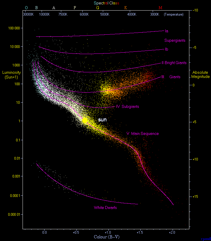
With the sun placed at its correct relative position, this is a Hertzsprung-Russell diagram with 22,000 stars plotted from the Hipparcos Mission Catalogue and 1,000 stars from the Gliese Catalogue of nearby stars
Abbreviated as the H–R diagram, HR diagram or HRD, the diagram, it is a scatter plot of stars showing the relationship between the stars’ absolute magnitude or luminosity and their stellar classifications or effective temperatures. It is also referred to as a color magnitude diagram or CMD with the ‘Color Index’ along the horizontal axis and the Luminosity (intrinsic power) along the vertical axis. The diagram was derived independently in 1911 by Ejnar Hertzsprung and Henry Norris Russell in 1913, and represented a major step towards an understanding of stellar evolution.
The two diagrams that follow map the stars of the young star cluster NGC-2264 (above) and were produced with PixInsight using the 3rd party HRD Plotting tool (please see citations below). The stars in the first chart are plotted without regard to their distance, just their apparent brightness (magnitude).
The second plot considers their distance and thus, the relative luminosities (vertical index) are an accurate representation of their intrinsic power (full spectrum brightness). This Absolute Magnitude is any star’s visual magnitude measured at 32 light years or 10 parsecs. It is noteworthy in this diagram that a separate population of stars is apparent, evidenced by the parallel track visible alongside the main sequence (track of stars running from the lower right to the upper left).
Pre Main Sequence Member Stars
It should be noted that the shroud of gas and dust remaining from the cluster’s formation produces an extra reddening of the member stars. In addition, there is an abundance of cool, low-mass, ‘red’ stars. Since the cluster is less than 5 million years old, many stars are nascent, ‘pre-Main Sequence’, that is they haven’t yet stabilized and settled onto the Main Sequence.
This also accounts for the reddening – these stars are still forming and heating up. That point, the star’s age when it stabilizes and settles onto the Main Sequence, is known as its Zero-Age Main Sequence point or its ZAMS point. These diagrams are quite telling when considering the cluster’s age and the infancy of so many of its stars. The cluster also contains massive, hot, luminous blue stars at the top of the main sequence (note the blue stars in the upper left quadrant of each of the diagrams).
For reference, the sun would be positioned along the horizontal axis at a ‘Color Index’ of 0.65, between 0.6 and 0.7 (yellow – yellow-white). Its absolute magnitude is +4.83 (vertical axis). At 32 light years, it would be rather faint on the sky with a magnitude of 4.83. The human eye’s threshold is magnitude 6.0. Simply because of their small size, our eyes cannot detect stars with a magnitude fainter than 6.0. Our brilliant, beautiful sun would be close to the threshold of visibility at a distance of 32 light years – a relatively close distance. As a comparison, the star Vega, visible in the summer sky and one of the three stars of the ‘Summer Triangle’, is 25 light years away and appears with a bright, clear blue-white light in our summer skies. The sun at this same distance would be barely visible.
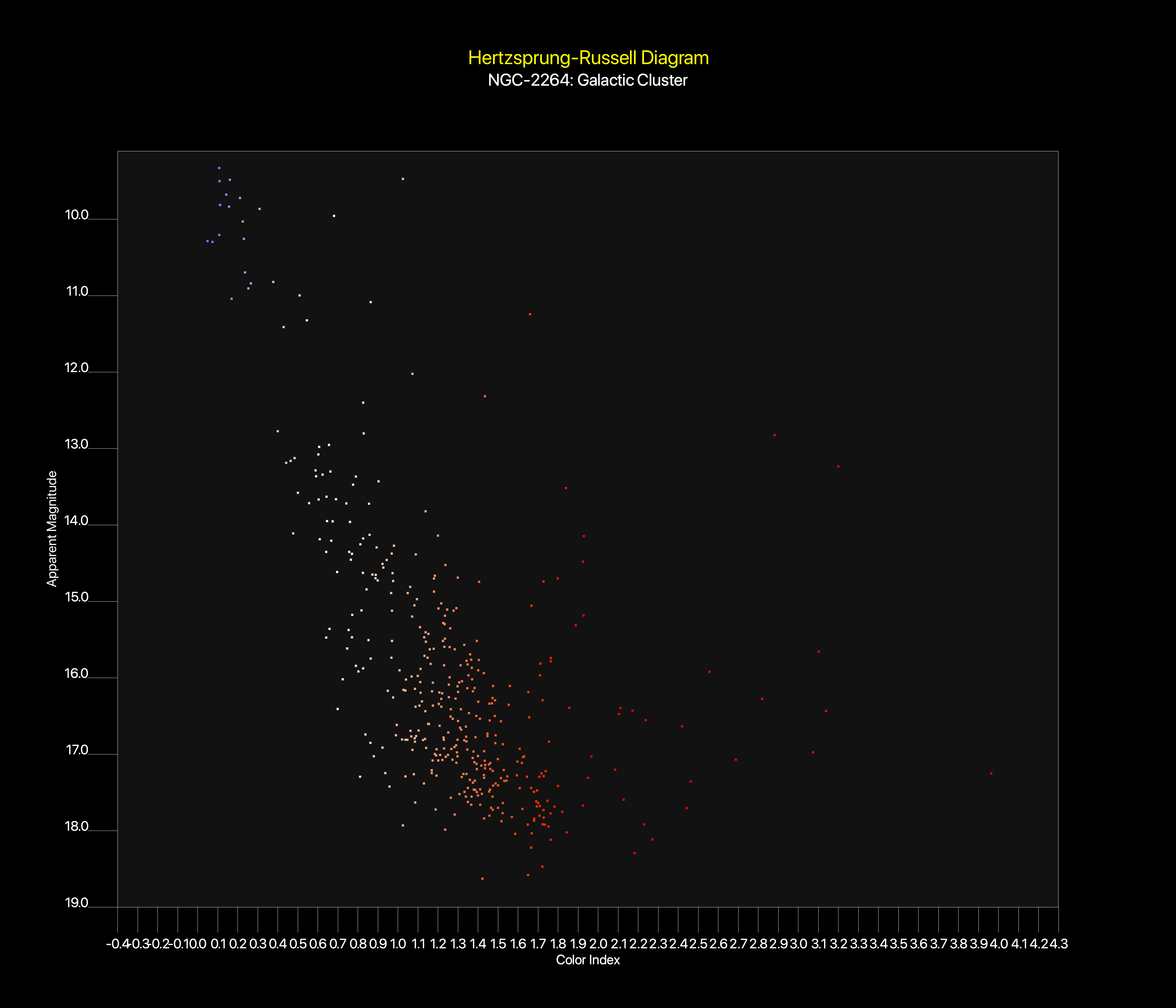
HR Diagram of the young star cluster NGC-2264, pictured above, produced with PixInsight’s HRD Plotter.
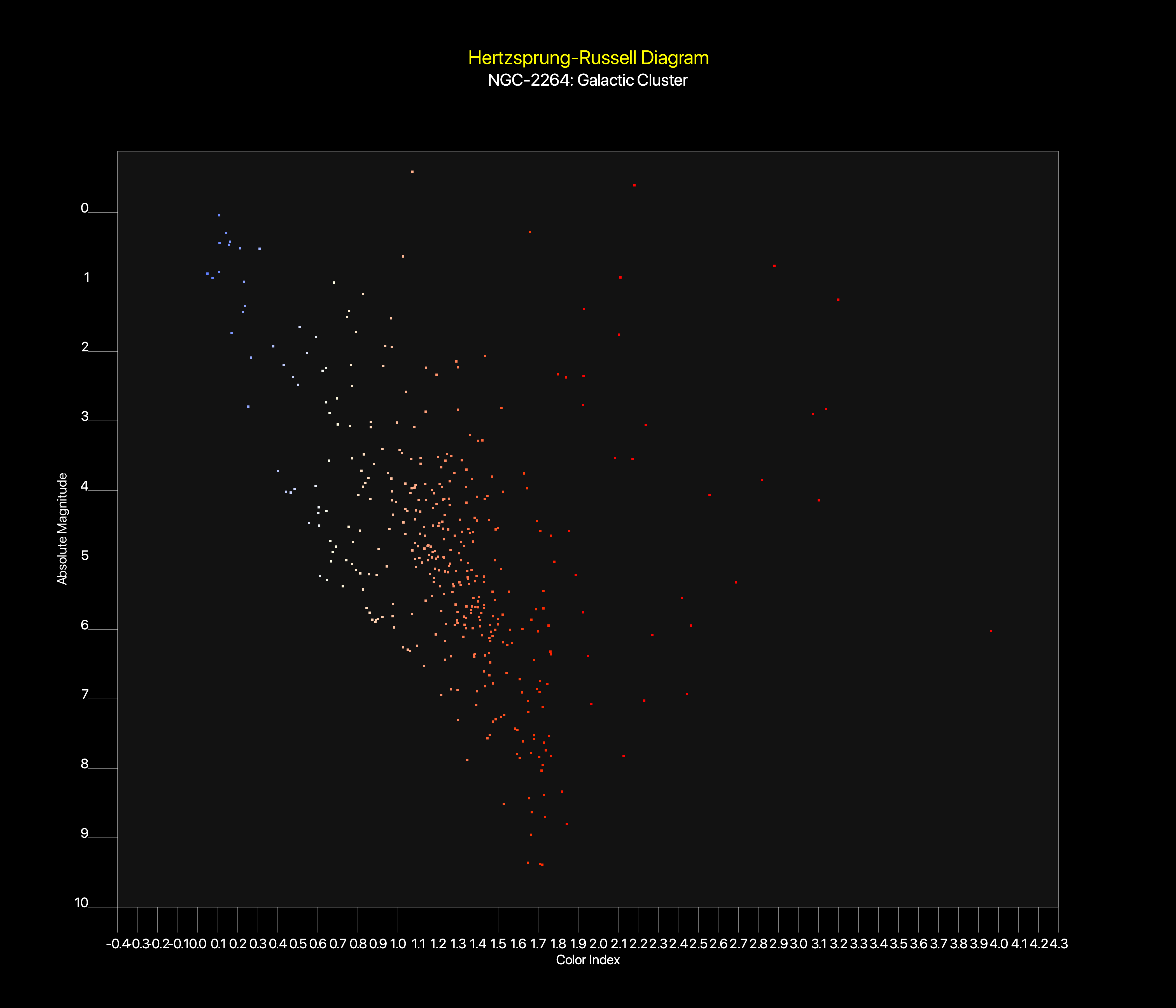
A second HR Diagram of the young star cluster NGC-2264 but taking into account the cluster’s distance, thus producing an accurate plot of the member stars relative luminosity (vertical axis) and color (Color Index – horizontal axis).
In order to better understand a star’s placement on the diagram and how the diagram can be used to its full capacity as a visual evolutionary diagram, it is necessary to briefly discuss the energy source that powers the stars.
The Nuclear Cauldron at the Core of Every Star
Every star shines by nuclear fusion reactions in their cores. In the case of our sun, through the enormous pressure and temperatures present at its core, four protons (Hydrogen nuclei) fuse to produce one helium nucleus and energy in the form of gamma rays. It’s the energy of these gamma rays that eventually makes its way to the sun’s photosphere (surface) and thus, to warm our planet and sustain life.
Take a look at the HR Diagram produced from Hipparcos mission data, above, and note the location of the sun. The sun is considered a “Yellow Dwarf”. In fact, all stars on the ‘Main Sequence’ are referred to as dwarfs, the cooler ones, “Red Dwarfs”, the hotter, bluer and more luminous, “Blue Dwarfs”. The line that connects these stars from the lower right corner (dim red dwarfs that live for 100s of billions to trillions of years) to the hot, luminous blue-white and blue dwarfs at the upper left corner that are 3 orders of magnitude (1000x) more luminous than the sun, is referred to as “The Main Sequence”. This track is where a star remains for the duration of its productive life, actively fusing 4 hydrogen nuclei to produce one helium nucleus and, in the process, producing energy and depleting its overall compliment of hydrogen in the process.
Stars like our sun remain on the Main Sequence for about 10 billion years, red dwarfs about 10x or 100x that long depending on their mass while stars more massive, hotter, bluer and more luminous, much less. In fact, hot blue stars at the top of the main sequence remain there for no more than ~ 10 million years or 1000x less than the sun!
In the case of the sun, when its compliment of hydrogen has been reduced to 12%, it will cease hydrogen-fusion reactions, contract, ignite the helium that has built up in its core and expand to become a red giant star, never to return to the Main Sequence. That point in its life is referred to as its “Turn Off” point or the point on the HR Diagram where it “Turns Off” the Main Sequence. Put a pin on this for now as it will be important in our continuing discussion in future installments of this series.
The relationship between color, temperature and luminosity can be easily visualized when looking at the HR Diagram. Cool main sequence stars are low mass, cool and red. Hot main sequence stars are high mass, hot and blue. As mentioned above, any object’s luminosity varies as the 4th power of its temperature. In addition, as the temperature increases, the peak wavelength emitted by the object decreases. Two effects of an increase in temperature: 1) sharp increase in total energy output (luminosity) and 2) bluer or shorter wavelength of the emitted light. As an aside, objects that behave like this are known as “Blackbodies”, named as such because they reflect no energy and emit their energy as described above. Stars are thus, approximated by Blackbody modeling.
PixInsight
What does all this have to do with “PixInsight”? After all, the title alludes to clusters, visual learning and PixInsight. PixInsight is a post imaging processing suite used by many astronomers and astrophotographers to process and enhance raw image data obtained with their telescopes and cameras to produce stunning celestial images unimaginable only a decade earlier. Before digital photography, film and plates were used and processed; many of us remember those days, at least this author does. With the advent of digital technology, all that changed.
PixInsight is a software suite (available for all major platforms, Mac, Windows and Linux), published by Pleiades Astrophoto, a software development company based in Spain. It was originally created by Juan Conejero, a Spanish professional software developer, Astrophotographer, Engineer, Principal Developer, Co-Founder and CEO of Pleiades Astrophoto.
As recently as last year, a new tool was released as a third-party add on to PixInsight to produce scientifically valuable diagrams imparting intrinsic value to images that otherwise had only esthetic value.
How Does it Work?
Summary
An ‘Astrometric Solution’ (the digital mapping of the image to its celestial coordinates) is obtained using PixInsight’s Image Solver Tool as the first post-processing step following color combination: (L-RGB or RGB).
PixInsight’s SPCC (SpectroPhotometric Color Calibration) tool is then used to produce an initial reference table of stars (written to a separate file specified when configuring the tool). This initial reference table is produced internally when the HRD tool begins. It matches the individual star’s celestial coordinate data (Right Ascension and Declination) contained in the image with an astrometric database such Gaia, (downloaded separately -see Pixinsight’s software tutorial page). The Gaia data contains the star’s parallax and thus its distance, essential data necessary to produce an accurate HR Diagram.
A final ‘Star Data’ file is produced, the data of which is mapped and transferred to the screen as the final diagram.
Pros
- First of its kind, turning PixInsight into a high-value Educational Tool
- Inherent in the 3-file design is the ability to recreate an HR Diagram without the original image.
- Various filters are available, providing the user with the ability to include or exclude stars based on the user’s requirements. For example, the ‘Distance Adjustment’ tool will produce an accurate representation of a cluster or group of stars according to ‘Absolute Magnitude’. Apparent magnitude is a star’s appearance on the sky without considering its distance, size, temperature or intrinsic luminosity.
Cons
Representation of any star in a produced HR Diagram is predicated on it being contained in an astrometric database of catalogued stars such as Gaia.
Citation
This third-party add-on to PixInsight, originally a collaborative project of Mike Cranfield, Adam Block of Adam Block Studios and John Hayes of Tucson, Arizona is known as the HRD Plotter (Hertzsprung-Russell Diagram) Plotter.
Note: The version of the HRD Plotter used by the author was modified by him, with permission from Mike Cranfield, to run on older versions of PixInsight (1.8.9-1 Ripley, x64) and Mac OS Catalina (OS 10.15.8). Anyone interested in using this adapted version is free to contact the author.
Featured image is NGC-2264, the “Christmas Tree” Nebula and associated star cluster. It was acquired with the AFIL-19 telescope of Insight Observatory, a 0.4 meter (16 inch) RCOS-RC.
Astronomy for Change is an AI Free Zone

From Las Cumbres Observatory, a quick, interactive web-based view of the sky at the moment, complete with interactive controls The Sky Now. The page includes “The Sky Tonight”, a quick, interactive web-based version of Stellarium.
Astronomy For Change: https://astronomyforchange.org
Did you enjoy this article or like what we do? Why not leave a tip or buy us a Coffee?
Follow Us On Twitter: https://twitter.com/astronomychange
Why not support us on Patreon: https://www.patreon.com/astronomyforchange
Imagination is more important than knowledge
![]()
An index of all articles can be found here.
Comment Moderation Policy
If you enjoyed this article, please consider supporting us with a modest donation
or through a subscription on our Patreon Page
Membership at Astronomy for Change is Free!

2 thoughts on “From Code to Cluster: Visualize and Learn Astronomy Using PixInsight to Build an HR Diagram”